Kindness is Magic |
Website Visual Design
Case Study
Role: UX / Visual DesignerProject Duration: 4 MonthsSkills: Graphic Design, Web Design, Wireframing, Visual Design, Stakeholder Collaboration
Jennifer Cullenbine Pietrasik
Founder of Kindness Is Magic
"Working with Katie was a dream.. she truly listened and created something so much better than I had imagined!"


Problem
Without a digital presence:
- Potential donors and volunteers couldn’t understand the organization or trust it
- Opportunities for fundraising and partnerships were limited
- Community engagement and visibility were effectively nonexistent
Constraints:
- Minimal brand assets (only a logo)
- No user data; new nonprofit with no employees
- Design needed to be developer-friendly and simple to implement
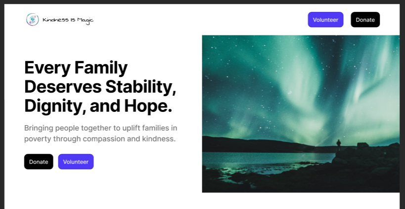
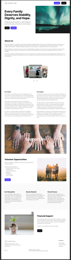
Kindness is Magic, a newly established nonprofit in Milpitas, CA, lacked a website to communicate its mission, showcase initiatives, and inspire donations or volunteer engagement. The organization only had a logo and mission statement.
Users & Goals
Target Users
- Potential Donors – Want to understand mission, see impact, and donate confidently.
- Volunteers – Seek easy ways to find opportunities and participate.
- Community Partners – Evaluate credibility for collaboration opportunities.
Research Approach
Research Objective:
I wanted to understand how nonprofit websites communicate mission effectively and motivate users to donate or volunteer.
Methods:
- Competitive Analysis: Studied nonprofit websites to identify best practices for storytelling, calls-to-action, and visual hierarchy.
- Stakeholder Interview: Discussed the mission, programs, and desired user actions with the founder.
- Observational Review: Analyzed UX patterns that support trust and engagement.
How Insights Shaped Design
Insight
Users need to trust the organization
Emotional storytelling motivates engagement
Users need clear calls-to-action
Information should be easy to scan
Design Response
Highlighted mission, founder story, and visual credibility cues
Used images, icons, and impact-focused storytelling in layouts
Prominent Donate & Volunteer buttons placed throughout the site
Simplified content, headings, and cards to guide attention
Key Insights
- Trust is critical – Users need to see credibility and transparency to engage.
- Emotional storytelling motivates action – Visuals and stories about impact help users connect.
- Clear calls-to-action are essential – Users need obvious ways to donate or volunteer.
- Information should be easy to scan – Users prefer concise content with visual cues.
Ideation & Exploration
Early Ideas:
- Explored homepage layouts that balance storytelling with calls-to-action
- Focused on visual hierarchy to guide users from mission → impact → action
Wireframes:
- Low-fidelity sketches of homepage, programs, and action sections
- Emphasis on scanning, information hierarchy, and clarity
Alternate Concepts:
- Donation-focused homepage: Too abrupt; users lacked context
- Storytelling-first homepage: Emotional connection strong, but actions were buried
Final Direction:
- Balanced storytelling with visible calls-to-action
- Mission and impact upfront, actions always accessible
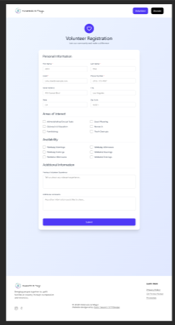
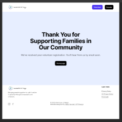
Final Design
Validation & Iteration
Testing:
- 5 potential users (donors & volunteers)
- Usability sessions + stakeholder feedback
What Worked:
- Mission clarity and CTA visibility
- Users could locate and complete donation and volunteer signup flows without assistance during testing.
What Didn’t Work:
- Program descriptions too dense
- Excessive scrolling on mobile
Changes Made:
- Simplified program cards for scanning
- Added visual cues to guide attention
Outcome
- Users could understand mission within 10 seconds
- Clear call-to-action pathways were created for donations and volunteer signups.
- Stakeholders were confident the site builds credibility and trust
Success Metrics (hypothetical):
- 80–90% of users can locate donation/volunteer options without help
- Increased engagement and likelihood of contributing to programs
Reflection & Learnings
What I Learned About Users:
- Users respond positively to clear, scannable storytelling paired with visual cues
- Trust signals are critical for new organizations
What I’d Do Differently Next Time:
- Conduct more iterative testing on mobile earlier in the process
- Explore A/B testing for different homepage storytelling approaches
One Skill I Want to Improve:
- Creating a scalable design system for nonprofits with limited brand assets
Additional Considerations:
- Accessibility: Tested color contrast and font readability for clarity
- Design system: Buttons, cards, and CTAs were standardized for consistency
- Edge cases: Designed for users with limited digital literacy and users using assistive technologies.
- Future Improvements: Front-end implementation by the development team, followed by analytics integration to measure engagement and inform future UX improvements.

Age: 34
Education: Bachelor’s Degree
Hometown: Seattle, WA
Family: 1 Cat, 1 Dog
Occupation: Marketing Rep
“Before I donate, I want to know exactly who they help and how my money will be used.”
Rachel wants to donate to trustworthy charities, but she’s frustrated by unclear websites.
Raven Green
Goals
Frustrations
Primary Goal:
Users want to quickly understand the mission and find a clear way to support the organization.
Secondary Goal:
Learn about programs, feel an emotional connection, and easily contact or follow the organization.
Time Constraints:
Frustrating User Experience:
Lack of Clear Information:

Designing for Impact: $9K Saved
This project saved Kindness Is Magic $9,186-- allowing for funds raised to go towards purchasing holiday gifts for underserved families.
Link
Kindness is Magic | Website Visual Design Case Study
Role: UX / Visual DesignerProject Duration: 4 MonthsSkills: Graphic Design, Web Design, Wireframing, Visual Design, Stakeholder Collaboration
Jennifer Cullenbine Pietrasik
Founder of Kindness Is Magic

"Working with Katie was a dream.. she truly listened and created something so much better than I had imagined!"
Problem
Without a digital presence:
- Potential donors and volunteers couldn’t understand the organization or trust it
- Opportunities for fundraising and partnerships were limited
- Community engagement and visibility were effectively nonexistent
Constraints:
- Minimal brand assets (only a logo)
- No user data; new nonprofit with no employees
- Design needed to be developer-friendly and simple to implement
Kindness is Magic, a newly established nonprofit in Milpitas, CA, lacked a website to communicate its mission, showcase initiatives, and inspire donations or volunteer engagement. The organization only had a logo and mission statement.
Users & Goals
Target Users
- Potential Donors – Want to understand mission, see impact, and donate confidently.
- Volunteers – Seek easy ways to find opportunities and participate.
- Community Partners – Evaluate credibility for collaboration opportunities.
“Before I donate, I want to know exactly who they help and how my money will be used.”
Age: 34
Education: Bachelor’s Degree
Hometown: Seattle, WA
Family: 1 Cat, 1 Dog
Occupation: Marketing Professional
Goals
Frustrations
Primary Goal:
Users want to quickly understand the mission and find a clear way to support the organization.
Time Constraints:
Frustrating User Experience:
Lack of Clear Information:
Secondary Goal:
Learn about programs, feel an emotional connection, and easily contact or follow the organization.
Rachel wants to donate to trustworthy charities, but she’s frustrated by unclear websites.
Research Approach
Research Objective:
I wanted to understand how nonprofit websites communicate mission effectively and motivate users to donate or volunteer.
Methods:
- Competitive Analysis: Studied nonprofit websites to identify best practices for storytelling, calls-to-action, and visual hierarchy.
- Stakeholder Interview: Discussed the mission, programs, and desired user actions with the founder.
- Observational Review: Analyzed UX patterns that support trust and engagement.
How Insights Shaped Design
Insight
Users need to trust the organization
Emotional storytelling motivates engagement
Users need clear calls-to-action
Information should be easy to scan
Design Response
Highlighted mission, founder story, and visual credibility cues
Used images, icons, and impact-focused storytelling in layouts
Prominent Donate & Volunteer buttons placed throughout the site
Simplified content, headings, and cards to guide attention
Key Insights
- Trust is critical – Users need to see credibility and transparency to engage.
- Emotional storytelling motivates action – Visuals and stories about impact help users connect.
- Clear calls-to-action are essential – Users need obvious ways to donate or volunteer.
- Information should be easy to scan – Users prefer concise content with visual cues.
Ideation & Exploration
Early Ideas:
- Explored homepage layouts that balance storytelling with calls-to-action
- Focused on visual hierarchy to guide users from mission → impact → action
Wireframes:
- Low-fidelity sketches of homepage, programs, and action sections
- Emphasis on scanning, information hierarchy, and clarity
Alternate Concepts:
- Donation-focused homepage: Too abrupt; users lacked context
- Storytelling-first homepage: Emotional connection strong, but actions were buried
Final Direction:
- Balanced storytelling with visible calls-to-action
- Mission and impact upfront, actions always accessible
Final Design
Validation & Iteration
Testing:
- 5 potential users (donors & volunteers)
- Usability sessions + stakeholder feedback
What Worked:
- Mission clarity and CTA visibility
- Users could locate and complete donation and volunteer signup flows without assistance during testing.
What Didn’t Work:
- Program descriptions too dense
- Excessive scrolling on mobile
Changes Made:
- Simplified program cards for scanning
- Added visual cues to guide attention
Outcome
- Users could understand mission within 10 seconds
- Clear call-to-action pathways were created for donations and volunteer signups.
- Stakeholders were confident the site builds credibility and trust
Success Metrics (hypothetical):
- 80–90% of users can locate donation/volunteer options without help
- Increased engagement and likelihood of contributing to programs
Reflection & Learnings
What I Learned About Users:
- Users respond positively to clear, scannable storytelling paired with visual cues
- Trust signals are critical for new organizations
What I’d Do Differently Next Time:
- Conduct more iterative testing on mobile earlier in the process
- Explore A/B testing for different homepage storytelling approaches
One Skill I Want to Improve:
- Creating a scalable design system for nonprofits with limited brand assets
Additional Considerations:
- Accessibility: Tested color contrast and font readability for clarity
- Design system: Buttons, cards, and CTAs were standardized for consistency
- Edge cases: Designed for users with limited digital literacy and users using assistive technologies.
- Future Improvements: Front-end implementation by the development team, followed by analytics integration to measure engagement and inform future UX improvements.
Designing for Impact: $9K Saved
This project saved Kindness Is Magic $9,186-- allowing for funds raised to go towards purchasing holiday gifts for underserved families.
LinkKindness is Magic | Website Visual Design Case Study
Role: UX / Visual DesignerProject Duration: 4 MonthsSkills: Graphic Design, Web Design, Wireframing, Visual Design, Stakeholder Collaboration
Jennifer Cullenbine Pietrasik
Founder of Kindness Is Magic
"Working with Katie was a dream.. she truly listened and created something so much better than I had imagined!"
Problem
Without a digital presence:
- Potential donors and volunteers couldn’t understand the organization or trust it
- Opportunities for fundraising and partnerships were limited
- Community engagement and visibility were effectively nonexistent
Constraints:
- Minimal brand assets (only a logo)
- No user data; new nonprofit with no employees
- Design needed to be developer-friendly and simple to implement
Kindness is Magic, a newly established nonprofit in Milpitas, CA, lacked a website to communicate its mission, showcase initiatives, and inspire donations or volunteer engagement. The organization only had a logo and mission statement.
Users & Goals
Target Users
- Potential Donors – Want to understand mission, see impact, and donate confidently.
- Volunteers – Seek easy ways to find opportunities and participate.
- Community Partners – Evaluate credibility for collaboration opportunities.
“Before I donate, I want to know exactly who they help and how my money will be used.”
Age: 34
Education: Bachelor’s Degree
Hometown: Seattle, WA
Family: 1 Cat, 1 Dog
Occupation: Marketing Professional
Goals
Frustrations
Primary Goal:
Users want to quickly understand the mission and find a clear way to support the organization.
Time Constraints:
Frustrating User Experience:
Lack of Clear Information:
Secondary Goal:
Learn about programs, feel an emotional connection, and easily contact or follow the organization.
Rachel wants to donate to trustworthy charities, but she’s frustrated by unclear websites.
Research Approach
Research Objective:
I wanted to understand how nonprofit websites communicate mission effectively and motivate users to donate or volunteer.
Methods:
- Competitive Analysis: Studied nonprofit websites to identify best practices for storytelling, calls-to-action, and visual hierarchy.
- Stakeholder Interview: Discussed the mission, programs, and desired user actions with the founder.
- Observational Review: Analyzed UX patterns that support trust and engagement.
How Insights Shaped Design
Insight
Users need to trust the organization
Emotional storytelling motivates engagement
Users need clear calls-to-action
Information should be easy to scan
Design Response
Highlighted mission, founder story, and visual credibility cues
Used images, icons, and impact-focused storytelling in layouts
Prominent Donate & Volunteer buttons placed throughout the site
Simplified content, headings, and cards to guide attention
Key Insights
- Trust is critical – Users need to see credibility and transparency to engage.
- Emotional storytelling motivates action – Visuals and stories about impact help users connect.
- Clear calls-to-action are essential – Users need obvious ways to donate or volunteer.
- Information should be easy to scan – Users prefer concise content with visual cues.
Ideation & Exploration
Early Ideas:
- Explored homepage layouts that balance storytelling with calls-to-action
- Focused on visual hierarchy to guide users from mission → impact → action
Wireframes:
- Low-fidelity sketches of homepage, programs, and action sections
- Emphasis on scanning, information hierarchy, and clarity
Alternate Concepts:
- Donation-focused homepage: Too abrupt; users lacked context
- Storytelling-first homepage: Emotional connection strong, but actions were buried
Final Direction:
- Balanced storytelling with visible calls-to-action
- Mission and impact upfront, actions always accessible
Final Design
Validation & Iteration
Testing:
- 5 potential users (donors & volunteers)
- Usability sessions + stakeholder feedback
What Worked:
- Mission clarity and CTA visibility
- Users could locate and complete donation and volunteer signup flows without assistance during testing.
What Didn’t Work:
- Program descriptions too dense
- Excessive scrolling on mobile
Changes Made:
- Simplified program cards for scanning
- Added visual cues to guide attention
Outcome
- Users could understand mission within 10 seconds
- Clear call-to-action pathways were created for donations and volunteer signups.
- Stakeholders were confident the site builds credibility and trust
Success Metrics (hypothetical):
- 80–90% of users can locate donation/volunteer options without help
- Increased engagement and likelihood of contributing to programs
Reflection & Learnings
What I Learned About Users:
- Users respond positively to clear, scannable storytelling paired with visual cues
- Trust signals are critical for new organizations
What I’d Do Differently Next Time:
- Conduct more iterative testing on mobile earlier in the process
- Explore A/B testing for different homepage storytelling approaches
One Skill I Want to Improve:
- Creating a scalable design system for nonprofits with limited brand assets
Additional Considerations:
- Accessibility: Tested color contrast and font readability for clarity
- Design system: Buttons, cards, and CTAs were standardized for consistency
- Edge cases: Designed for users with limited digital literacy and users using assistive technologies.
- Future Improvements: Front-end implementation by the development team, followed by analytics integration to measure engagement and inform future UX improvements.
Designing for Impact: $9K Saved
This project saved Kindness Is Magic $9,186-- allowing for funds raised to go towards purchasing holiday gifts for underserved families.
Link